A More Playful Way to Choose Your Brand Colours
There is just something quite delicious about choosing colours that sit well together.
Be that in your garden, your living room, a vase of flowers… or your brand.
I've always found colour much more interesting when it's something you play with rather than something you feel you have to get ‘right’. And yet, when it comes to branding, choosing colours can suddenly feel very serious and set in stone.
What colours represent my business? What will appeal to my ideal client? Should I use blue because it feels trustworthy? Green because I'm a wellness practitioner? Yellow because I'm creative?
Of course, you can think about all of those things (and probably then overthink all of those things *holds hand up!*) But I think you can also start somewhere much more fun!
📸 Start with a photo you love.
If you're building new brand or giving your current one a refresh and you're not sure where to begin with your colour palette, here's a little trick I often suggest to clients:
Start with a favourite photo you’ve taken.
Rather than trying to come up with the perfect colour palette from scratch, I often suggest starting with something you already love and that already has real feeling for you, for example a photo that already has a combination of colours within it that makes you think, Ooh, I really like that.
It could be a landscape from a favourite trip, a cosy corner of your home, some wild flowers, the play of light and textures or simply an image that makes you feel something. Ideally, choose something that already feels like you, and perhaps something you know you want to feature in your brand or website – bonus if you have multiple photos of the setting to give you plenty of future design flexibility.
Then upload it to Coolors Image Picker (it’s free) and have a play with dragging the markers and pulling colours from the scene.
It's surprisingly addictive, so don't say I didn't warn you, ha ha.
Here are some colour palette examples from my road trips created on Coolors:
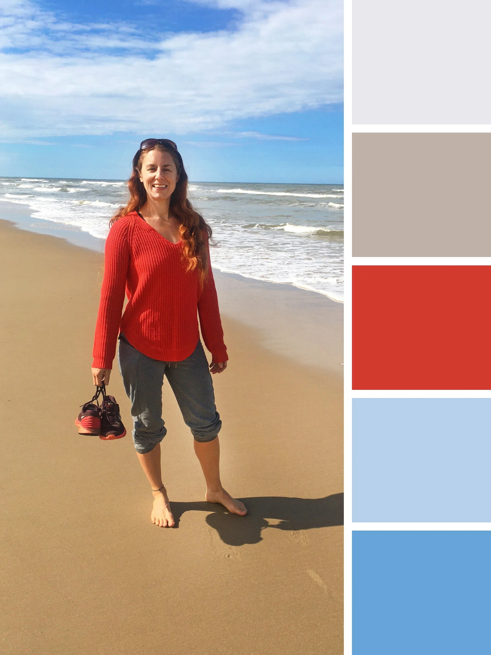
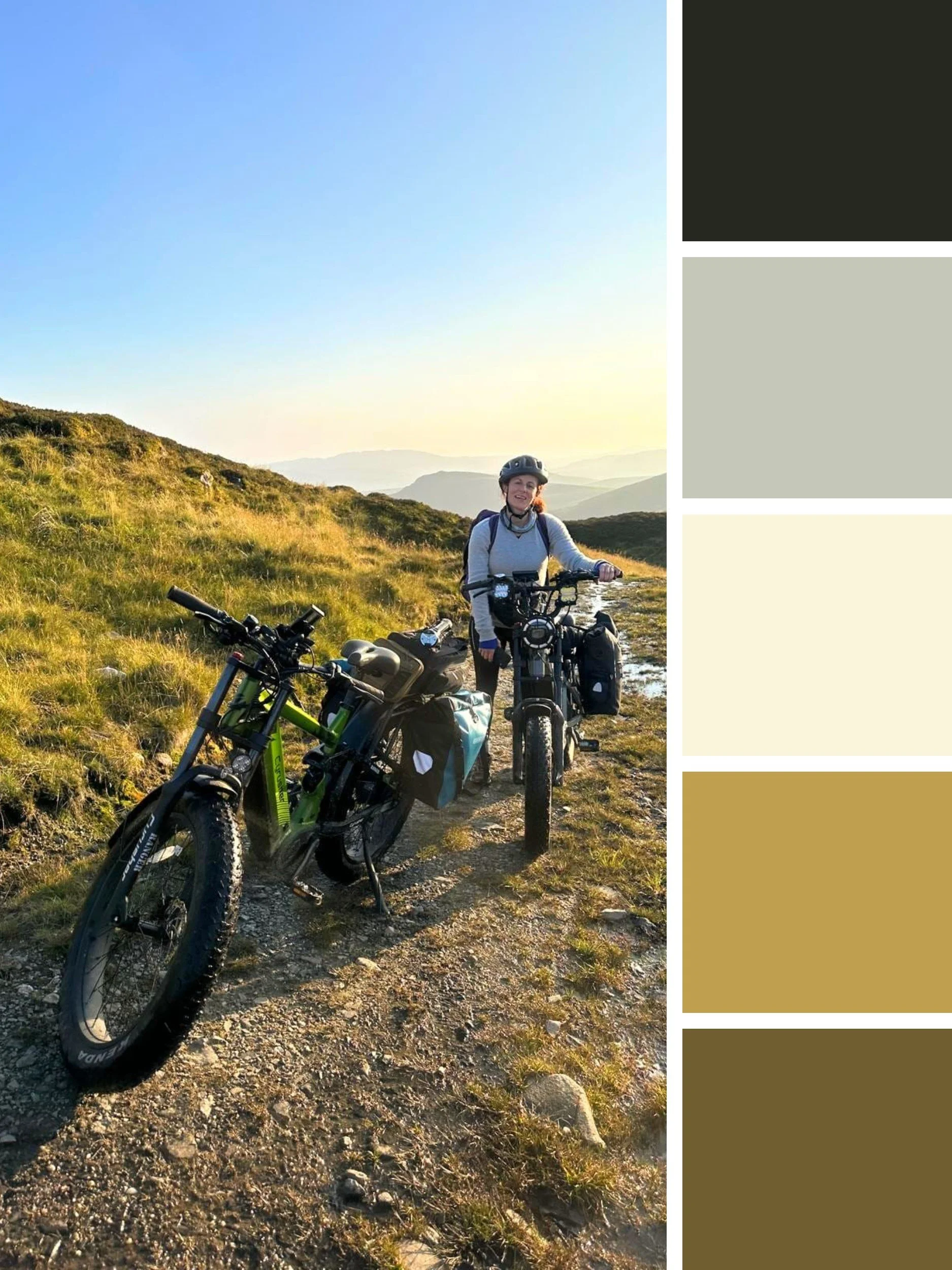
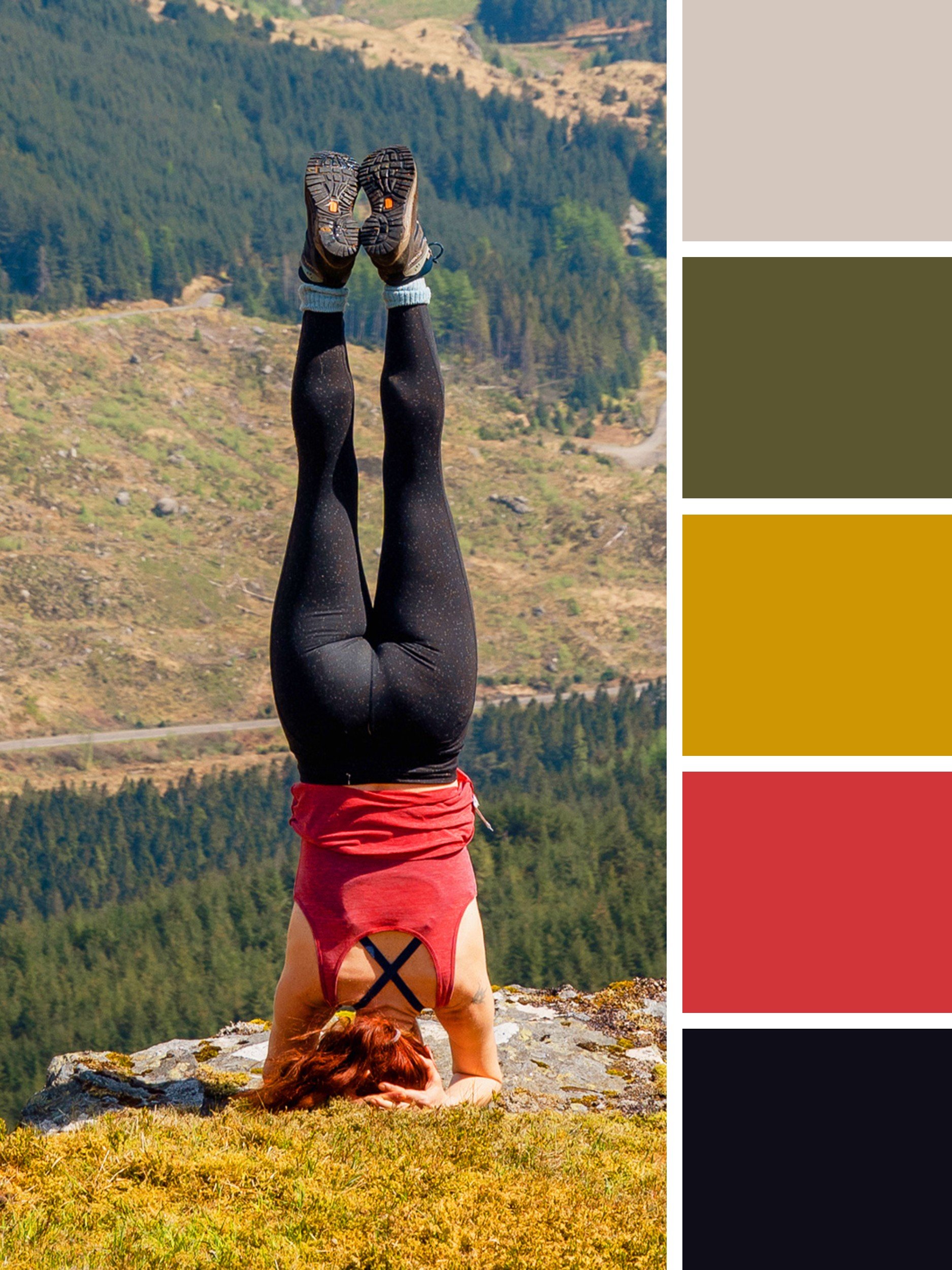
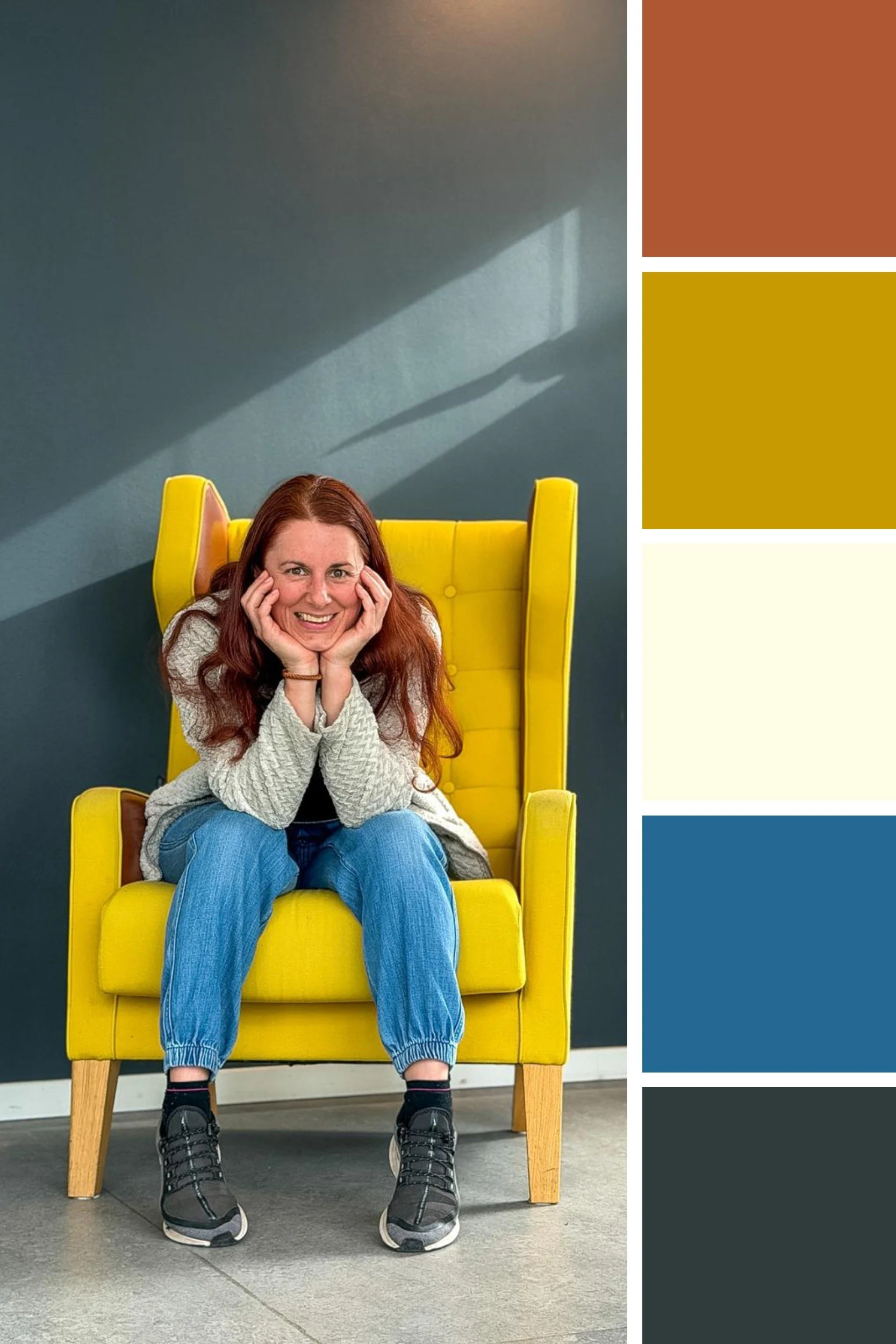
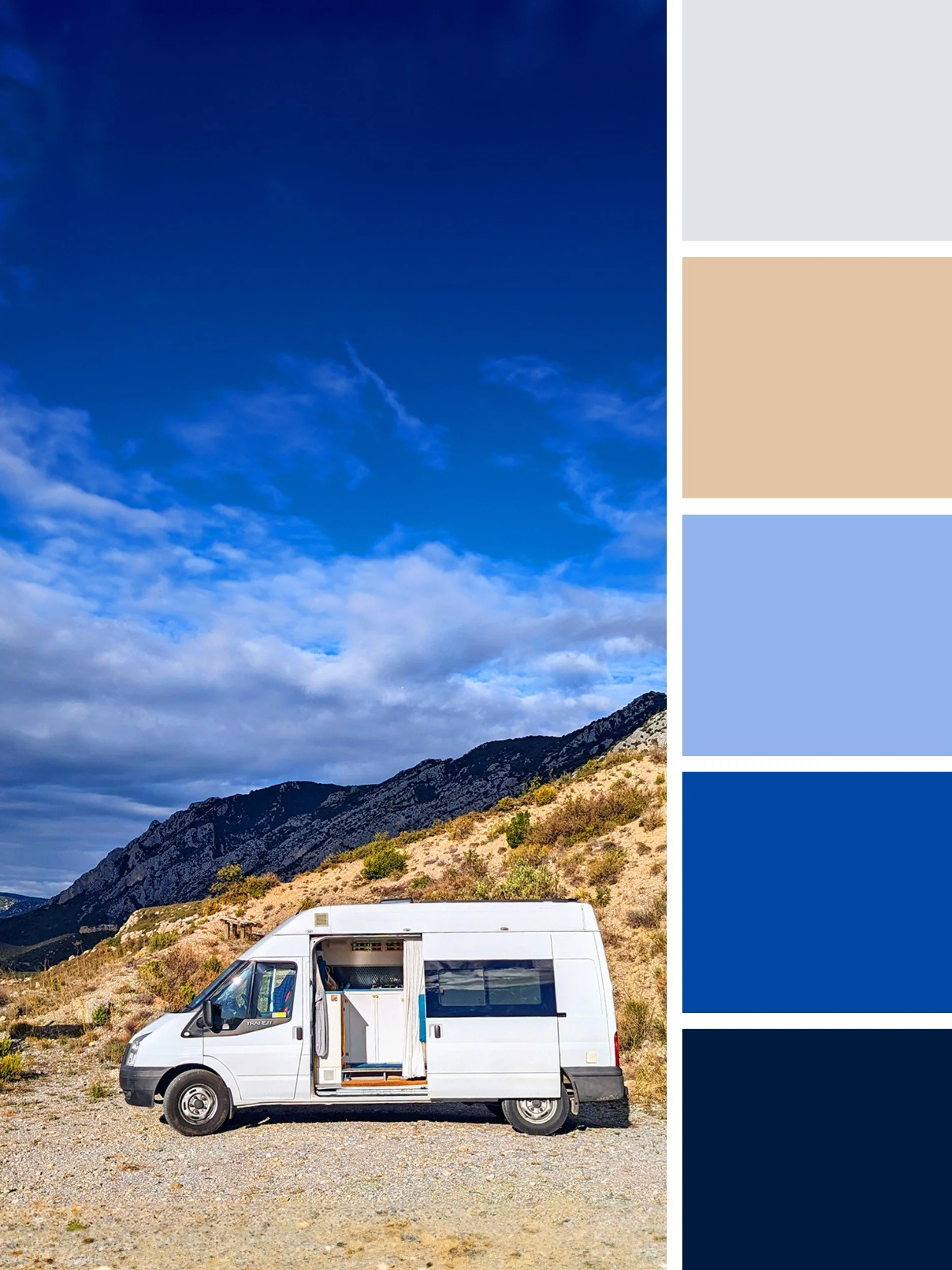
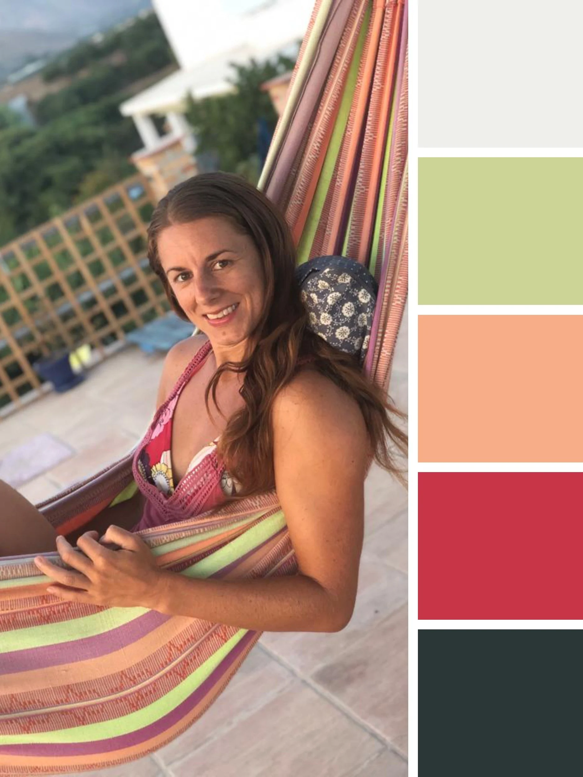
This is actually one of the reasons I take so many photographs when I'm travelling. I'm not consciously thinking about brand palettes, or Insta carousels or b-roll clips, but when I look back through my camera roll, I notice I’m often drawn to similar combinations of colours, textures and landscapes that loosely fit my brand (especially the mustard yellow pops!) and I’ll save them in a folder.
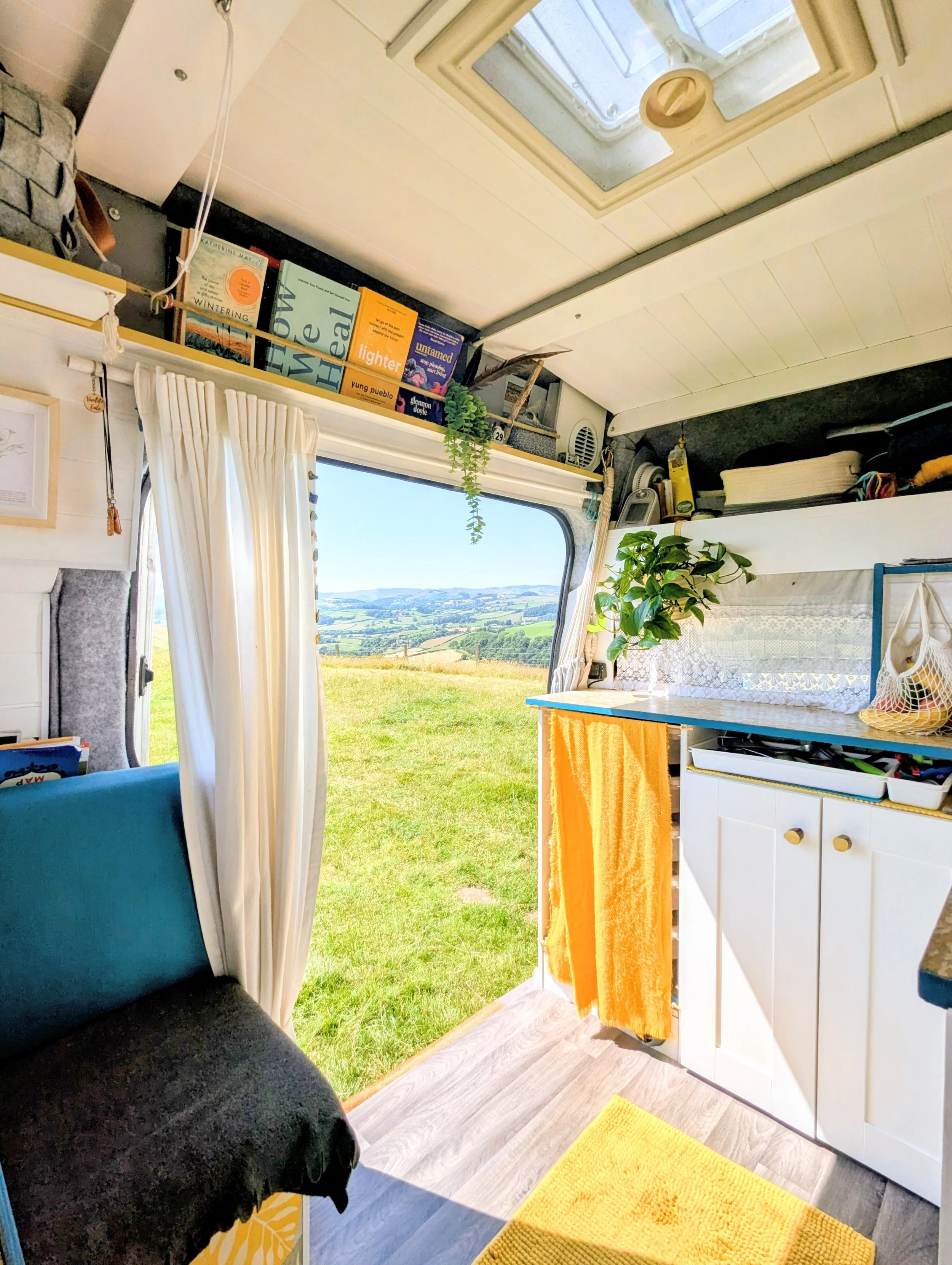
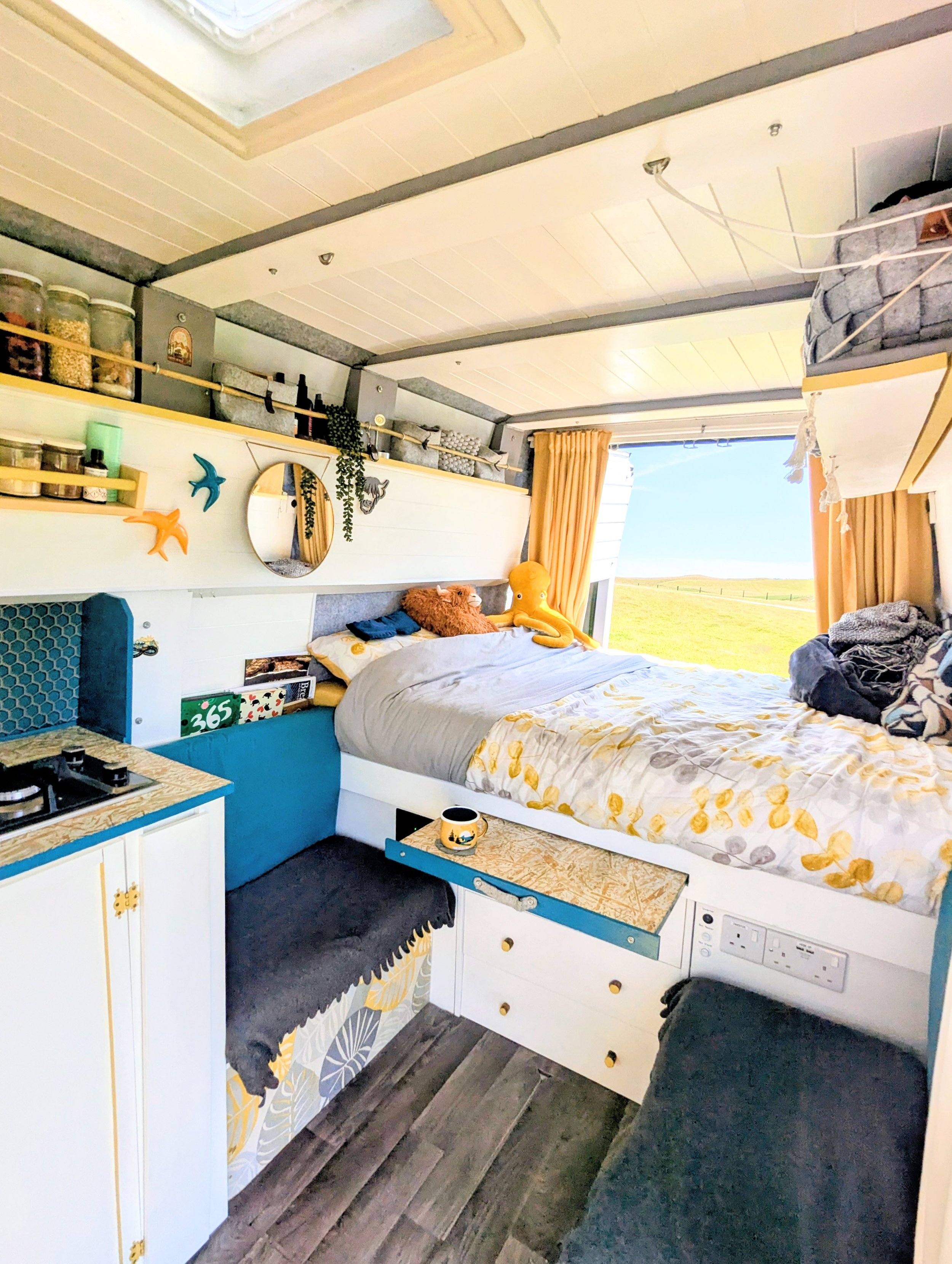
Fun fact: I even designed the interior styling of my camper van to match the mustard and teal of my brand and hadn’t even realised the connection until I’d completed the build - see below!
Looking at those patterns can tell you quite a lot about your visual preferences, sometimes more than sitting down and trying to decide what your brand ‘should’ look like.
You might discover that the colours you instinctively gravitate towards aren't the ones you thought you'd choose. Or that the colour you initially imagined as your main brand colour actually works much better as a little pop of contrast. That's absolutely fine, your colour palette doesn't have to be decided before you start playing, it will emerge as you go.
Here’s the inside of my little home on wheels :-)
( See what I mean, seems I really do like mustard yellow!)
🖍️ A five-colour recipe
When I'm creating a brand palette, I generally aim for five colours to play with.
It's enough to give you variety without creating competing colour chaos, and it happens to work particularly well for websites built in Squarespace, where the site-wide colour palette is based around five colours (more on that below).
As a starting point, try including:
One very dark colour – useful for text, buttons, contrast and grounding your palette.
One very light colour – lovely for backgrounds, an off-white accent and creating breathing space.
One bolder contrasting accent colour – your little pop of look at me!
Two colours somewhere in between – these are the ones that give you more flexibility and help everything hang together, useful for buttons, graphics and banners.
You don't have to follow this formula exactly, and you may chose to have more of less than five colours. Five is simply a useful place to start, particularly if you're working with Squarespace.
And don't worry if your favourite colour doesn't end up being the star of the show. Sometimes the colour you love most actually works better as the supporting character.
😊 Think about feeling, not colour psychology
There is some value in understanding basic colour psychology (and if you nerd over that kind of thing, go right ahead and dive in!) You'll often hear that yellow is associated with creativity and optimism, green with nature and wellbeing, blue with trust and calm, and red and orange with energy.
These associations can be useful prompts, particularly if you're completely stuck. But I wouldn't get too hung up on them, and end up creating a brand palette that could be at risk of looking generic to your field.
Colour doesn't exist in a vacuum. A particular shade of green can feel earthy, fresh, sophisticated, playful or downright murky all depending on what it's paired with. Similarly, a bright red used sparingly can feel completely different from a whole website covered in red.
So rather than asking, “What does this colour mean?”
I think a more useful question is, “What does this combination of colours make me feel?”
Fresh? Warm? Playful? Calm? Bold? Earthy? Energetic? A little bit quirky?
That is much closer to the job your brand colours are actually doing. Your colours should support the personality of your business and the experience you want people to have when they encounter it. They don't have to perfectly represent your business in some scientifically proven way.
✋🏻 Don't choose colours in isolation
One of the easiest mistakes to make is falling in love with a colour on its own.
And then you put it next to your other colours and suddenly… not so much.
Colours are relational. What matters isn't just whether you like each individual colour, but whether they like each other.
So spend some time really playing around. Put them next to one another, try them at different proportions and see what happens when your darkest colour becomes your text colour rather than your main colour.
You might find that a palette that looks slightly underwhelming as five little squares side by side, and suddenly comes alive when it's applied to a website, photograph or graphic.
Bonus tip – I always suggest using a very dark colour rather than default black for text (unless black is a brand colour) as it feels more considered, has a subtle softer edge and sits more cohesively within your palette.
This is also why I think it's helpful to think of your palette as a toolkit rather than a set of colours that all need to be used equally. You might use just one or two colours most of the time, with another appearing occasionally when you need a little variation or want something to stand out. Having five colours doesn't mean every design needs to contain all five and in fact, it probably shouldn't.
It also gives your brand some room to evolve. You might find new ways to use your colours as your business grows, or discover that one of them works particularly well for a new offer or part of your business. You have a visual system to work within without having to start from scratch every time you create something new.
🖼️ Build out the feeling with a mood board
Once you have some colours you like, you can take the experiment a little further with a mood board.
This is particularly good if you are a visual person, and is one of my favourite parts of the branding process when working with clients because it gives you a chance to stop thinking about individual colours and start thinking about the feeling of wider world you want your brand to inhabit.
Pinterest is great for this, but you could also use a template on Canva, a folder of saved images and screenshots on your phone, or if you're old school and like using your hands, grab a pile of magazines and a pair of scissors.
Collect anything that makes you think, “Ooh, I'd love my brand to feel like that.”
The important word here is feel.
Ignore other peoples branding and look for landscapes, interiors, clothing, architecture, food, textures, flowers, packaging, typography and patterns.
You're collecting visual clues about the atmosphere you want to create. You might start noticing that the same dusty greens keep appearing, or that you're drawn to warm, slightly faded colours, bold geometric shapes or lots of white space.
Around 15 to 30 images is plenty to give you something to work with. Once you've gathered them together, step back and look at the whole collection rather than analysing every image individually.
What colours keep appearing? What textures? What visual qualities? What kind of mood is emerging?
You might discover that your brand is much more sun-baked Mediterranean road trip than minimal beige wellness studio, despite what you originally thought it would be.
Little note, if you are working with a designer rather than DIY-ing your brand or website, having a sense of mood board and brand colours as a starting point to work with your designer on, can be so helpful too.
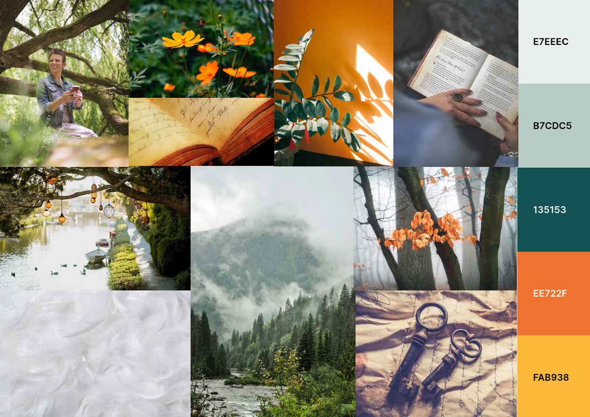
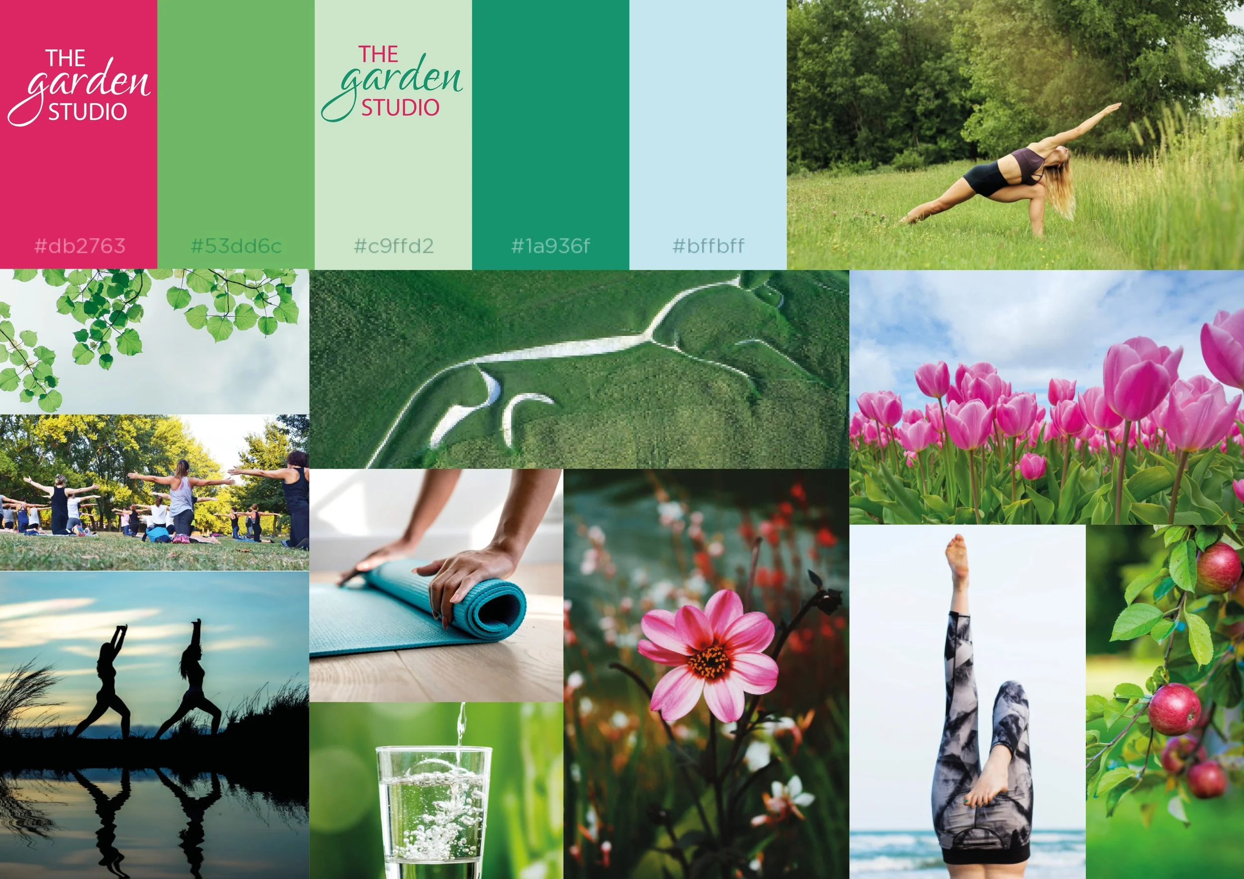
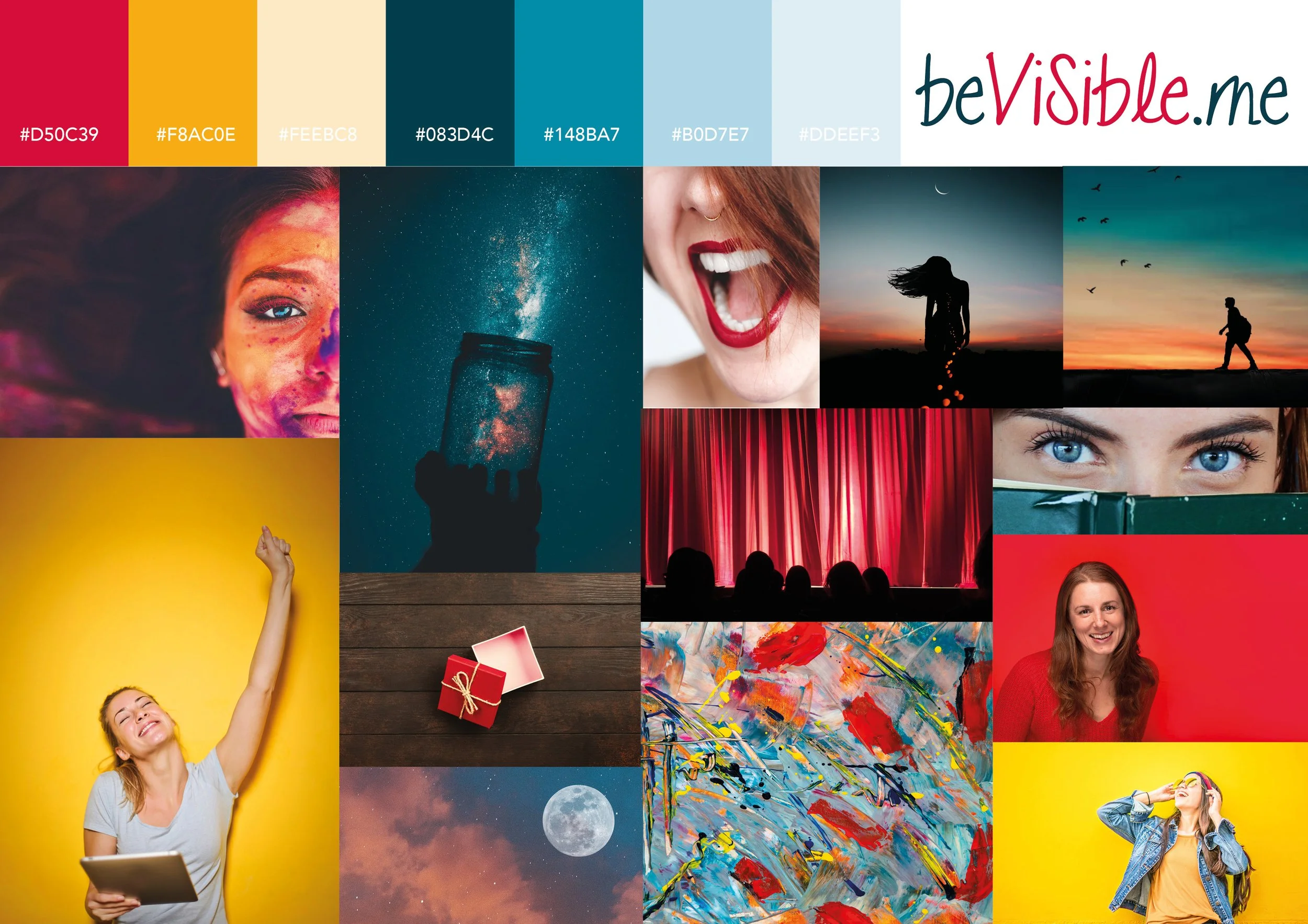
Here are some mini moodboards for previous brand developments:
(we started with more images and narrowed it to these).

🗒️ Same template, different personality
This is where colour gets particularly interesting for websites.
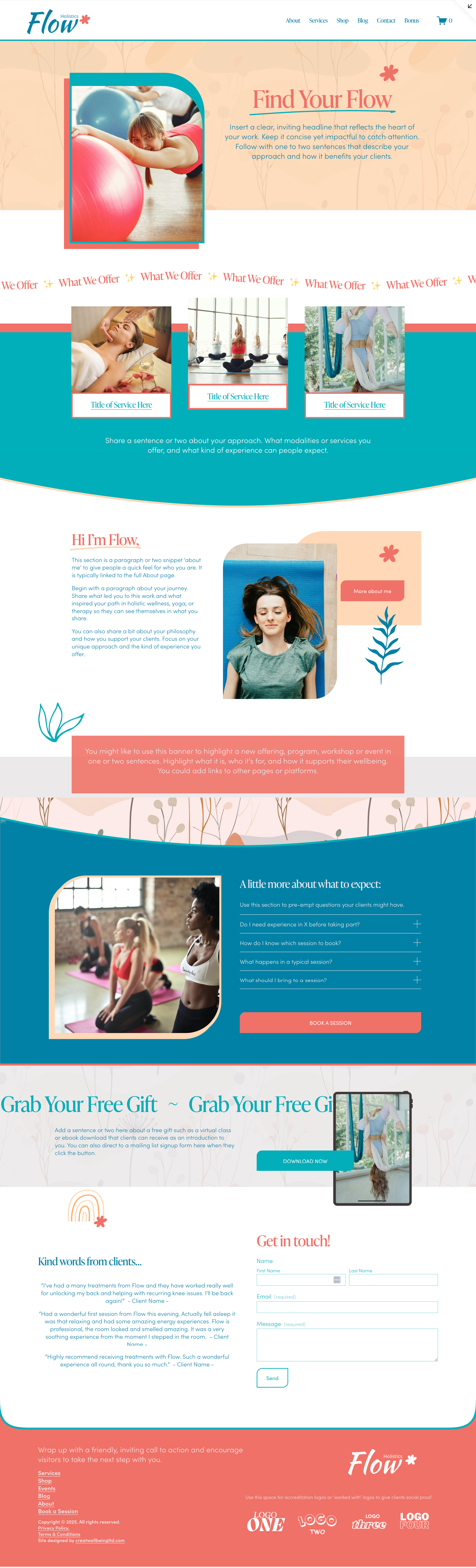
I've taken one of my website templates, FLOW, and created several versions with exactly the same layout. The structure is the same, the pages are the same, the content is the same and the sections are the same.
The only thing I've changed here is the colour palette.
And yet they quickly feel like very different websites.
(click the images below to zoom in and scroll through)
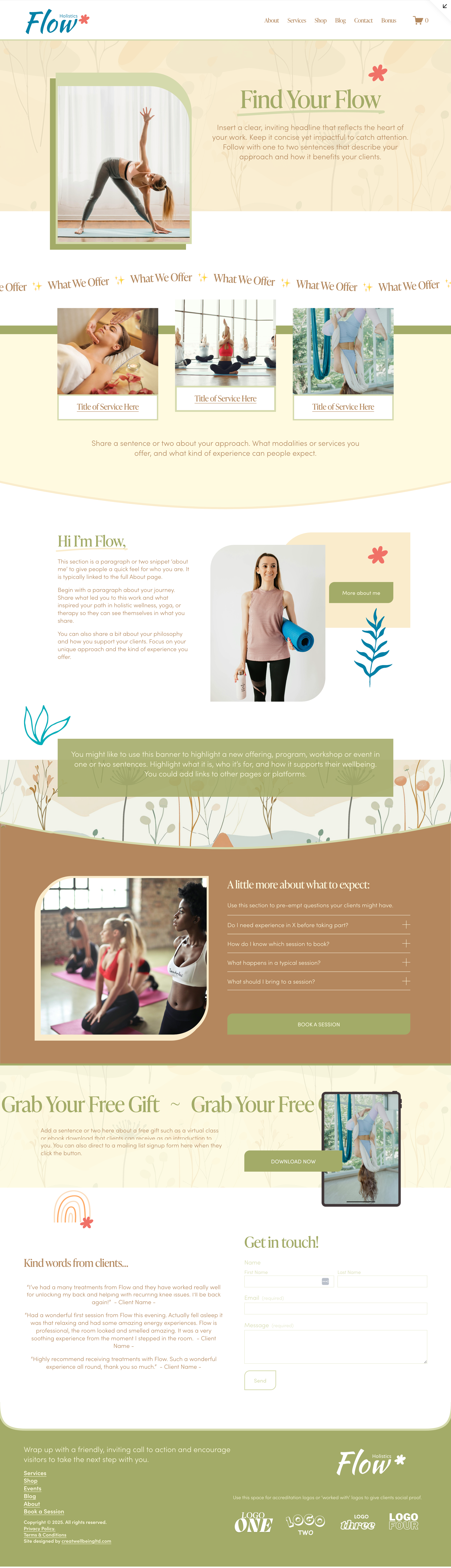
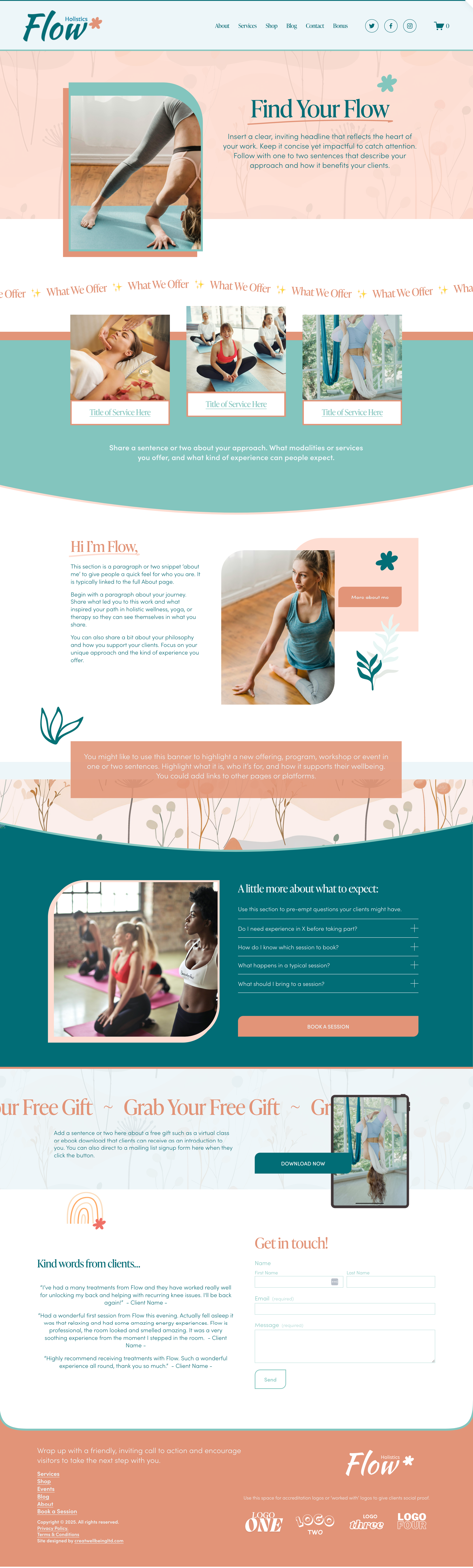
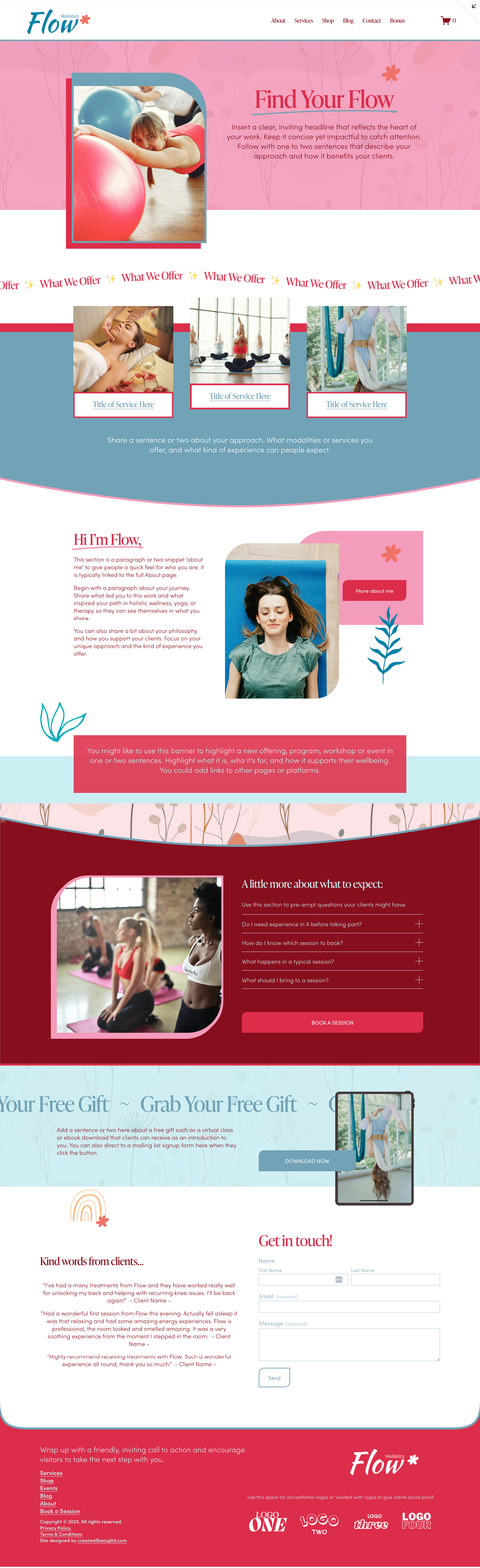
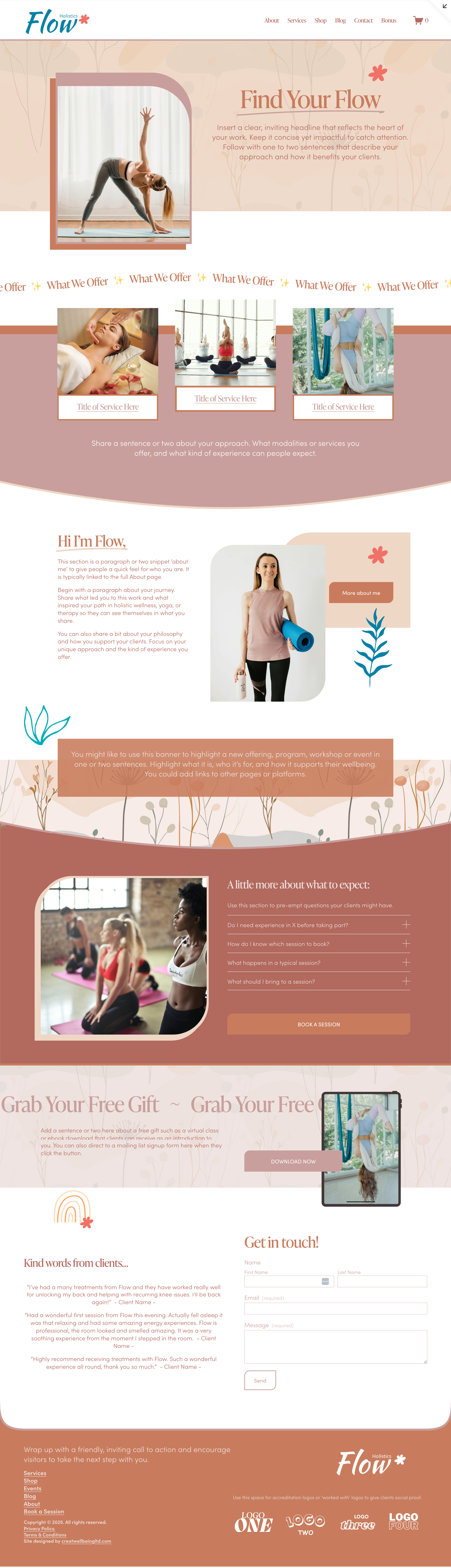
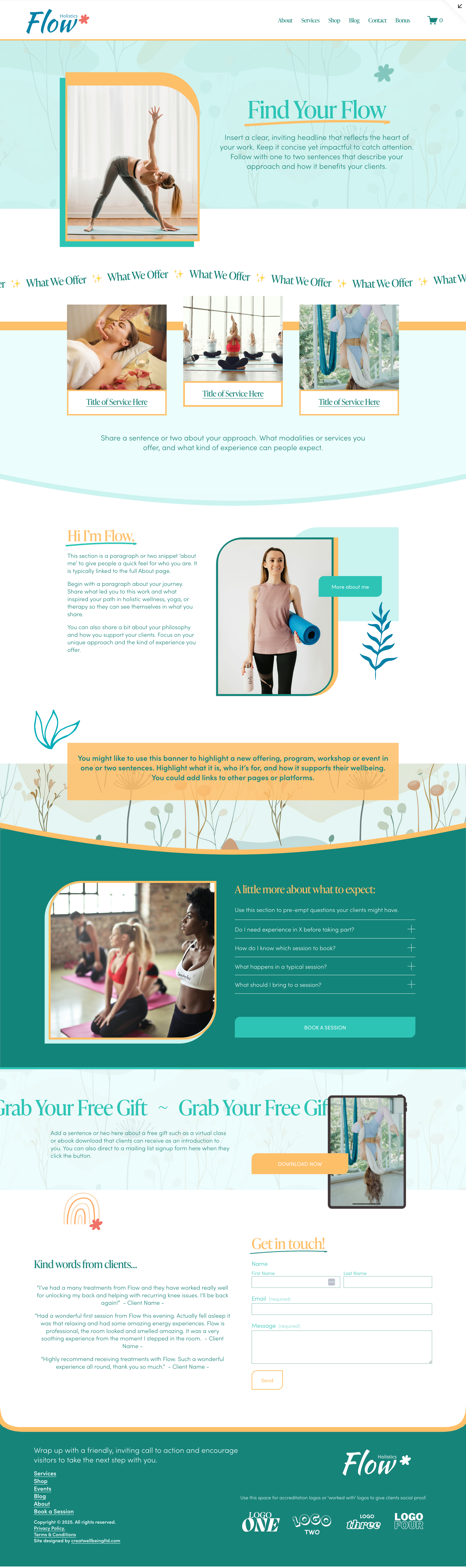
This is worth remembering if you're using a website template yourself, whether it be one of mine or from another platform. You might initially look at a template and think, “That's a nice layout, but it doesn't really feel like me.”
Before you dismiss it, try changing the colours.
In Squarespace, this is very simple to do in the ‘Site Styles’ and you can experiment with switching up your site-wide colour themes in just a few seconds. Swap one palette for another and you can completely change the atmosphere of the site before you've even added your own words, photographs or content.
And then, of course, you start adding your copy, your images, your fonts and all the little details that make a website yours. Suddenly that template doesn't look anything like the original at all.
This is one of the reasons I love working with my templates as a foundation to get started. It brings us back to this post I wrote recently about creative freedom ands structure, and why constraints don't necessarily make us less creative. Sometimes they give our creativity somewhere to go.
You don't always need a completely blank canvas. Often it’s better to have a good starting point, and the tools and inspiration to make it yours.
📝 A few tools to have a play with
You really don't need fancy software to experiment with brand colours.
Coolors, as already mentioned above, is my favourite place to start and it’s simple and playful. Under the Tools, menu you can generate palettes, pick colours from your images and more.
If you need to find the HEX code for a colour or convert between different colour formats, there are plenty of free colour converters online too.
If you're working in Squarespace, you can then take your chosen palette (or a few options to try) into your site-wide colour settings and see how it behaves in a real website rather than just as five little colour swatches.
And that's really the point. Don't spend hours trying to find the perfect palette in isolation or get bogged down in the technical stuff. Have a play first, see what happens and then decide on your final set of brand colours once you have seen what emerges.
✨ A final thought…
Your brand colours don't have to tell someone everything about your business. They don't need to communicate your entire personality, values, services and life story. Their job is much simpler than that - they help create a visual world around your business.
And the best way to discover what that world might look like is often to stop trying to design it perfectly and start noticing what you're naturally drawn towards.
So find some photos you love, and might want to use. Pull some colours from them. Shuffle them around. Try making one ridiculously bright. Make another much darker than you would have expected. Try combinations that shouldn't work and then see if they do.
You might be surprised by what you come up with!
If you're looking to build your own website…
Of course there is a lot more to it than your colours. Before you can start making your website look like you, it helps to have all the ingredients gathered together in one place: your words, images, brand colours, offers, links and all those little pieces of information that are surprisingly easy to lose track of.
My Website Content Companion is a practical and inspiring guide to help you gather everything you need for your brand: words, images, colours and clarity, so you can move forward with confidence.
It's also included as part of the Template Toolkit when you purchase one of my DIY website foundations, or work with me on a custom website build.